RepareCar
The repair shop routine, in the mechanic’s pocket.
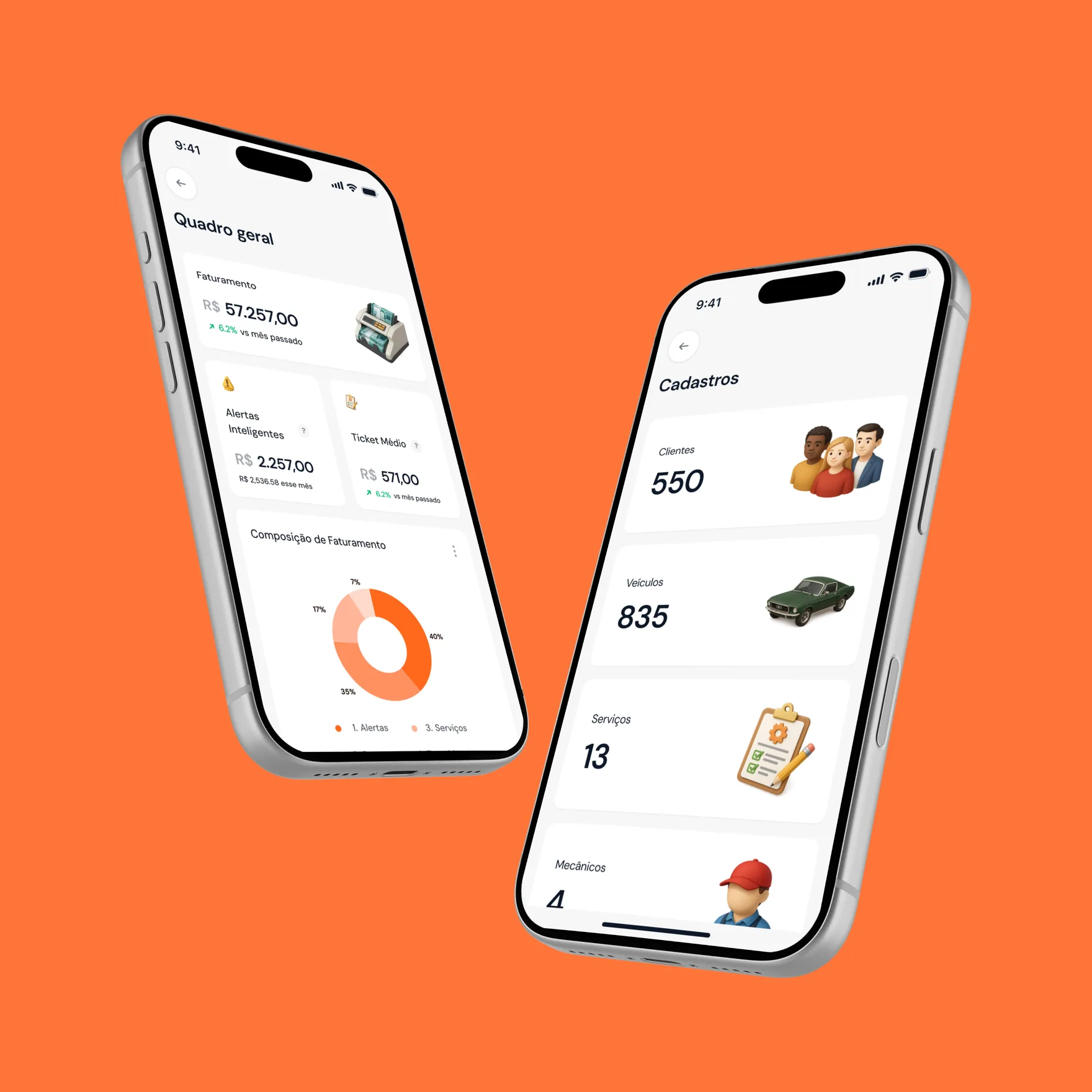
Responsive adaptation and visual refinement of RepareCar’s screens to support repair shop work on the move.
Context
A responsive experience for RepareCar
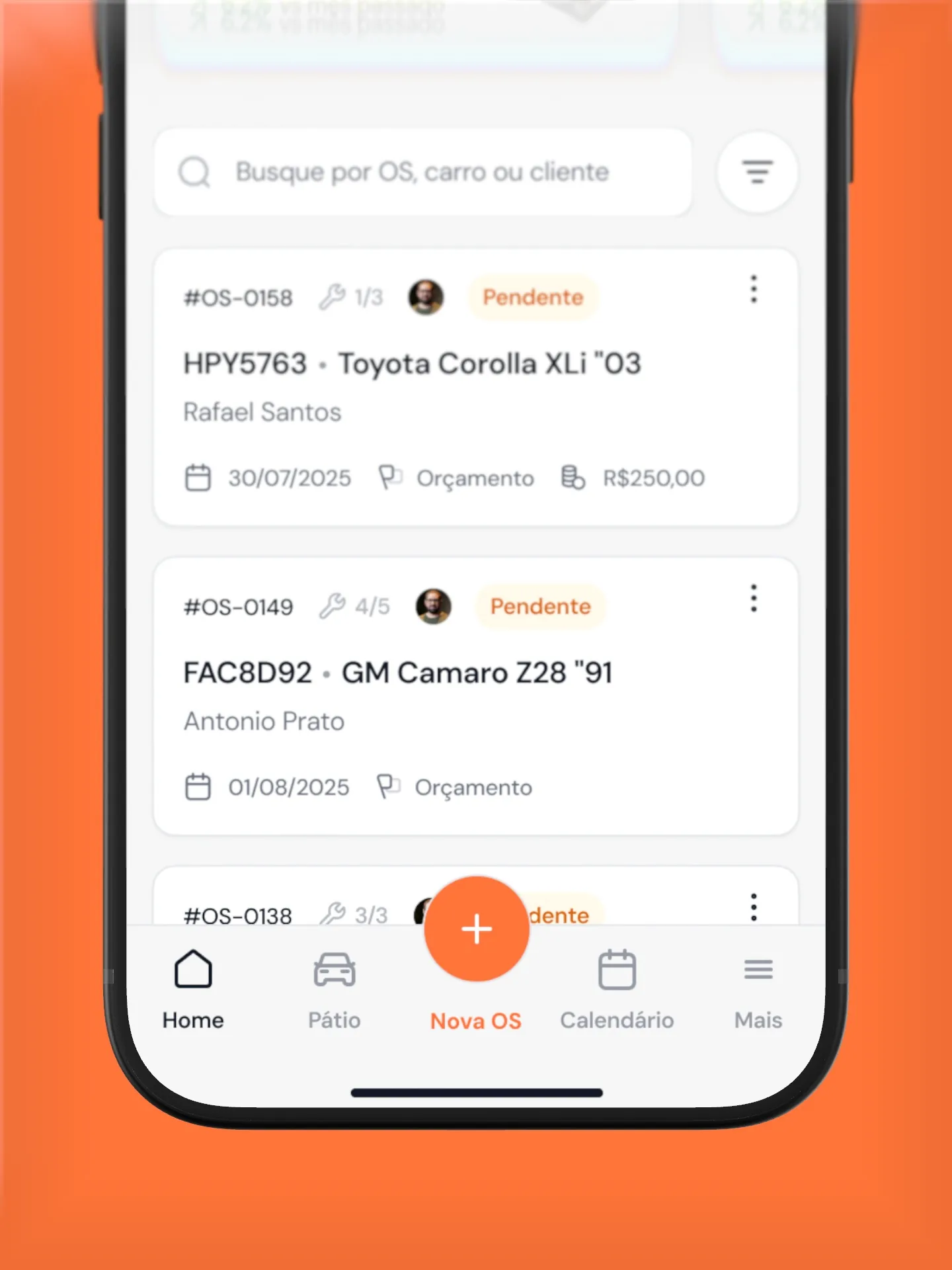
My role was to build RepareCar’s experience for smaller screens. I refined interface details and optimized mobile use while keeping the product clear and high quality. Beyond the static screens, I created the animated logo for the loading screen.
Brand
Orange, graphite and plenty of room for data
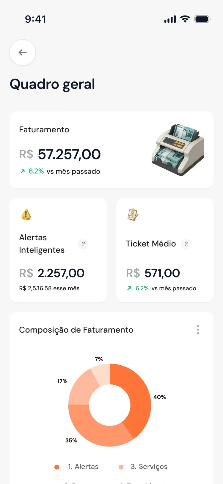
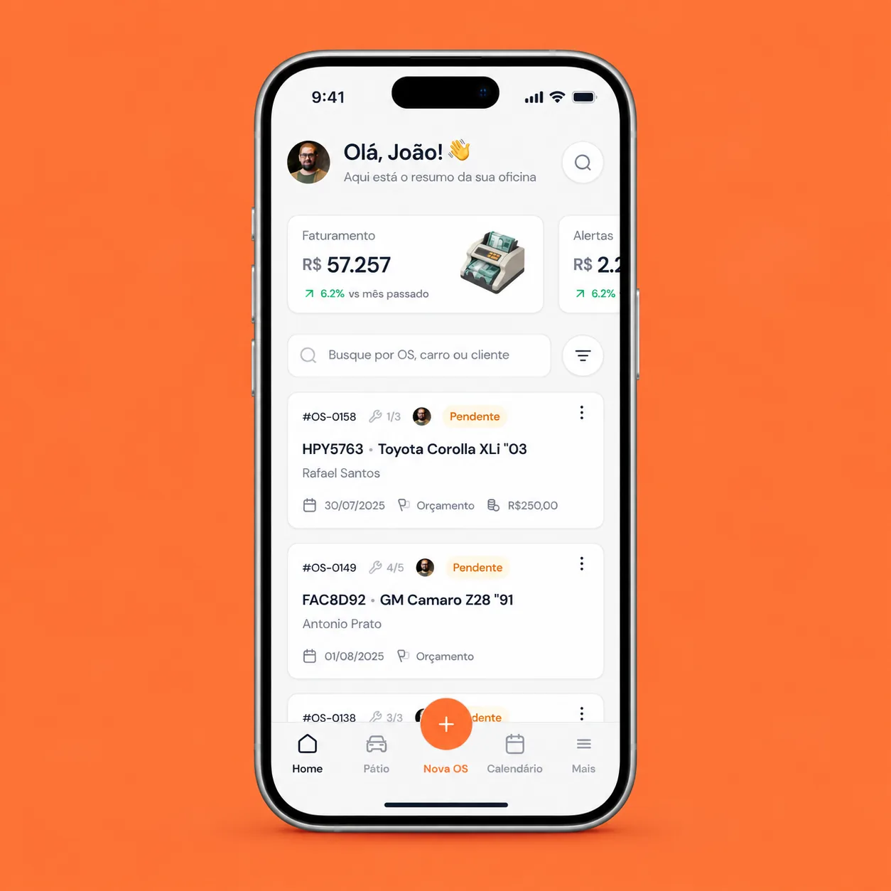
The interface uses DM Sans for headings and body, with a scale designed for quick reading on smaller screens, like revenue and next steps on the overview.
- Orange#FF7439
- Graphite#18202E
- Light gray#F7F8FA
- White#FFFFFF
Approximate reference taken from the screens, not an official brand specification.
Challenge
Keeping the desktop experience on mobile
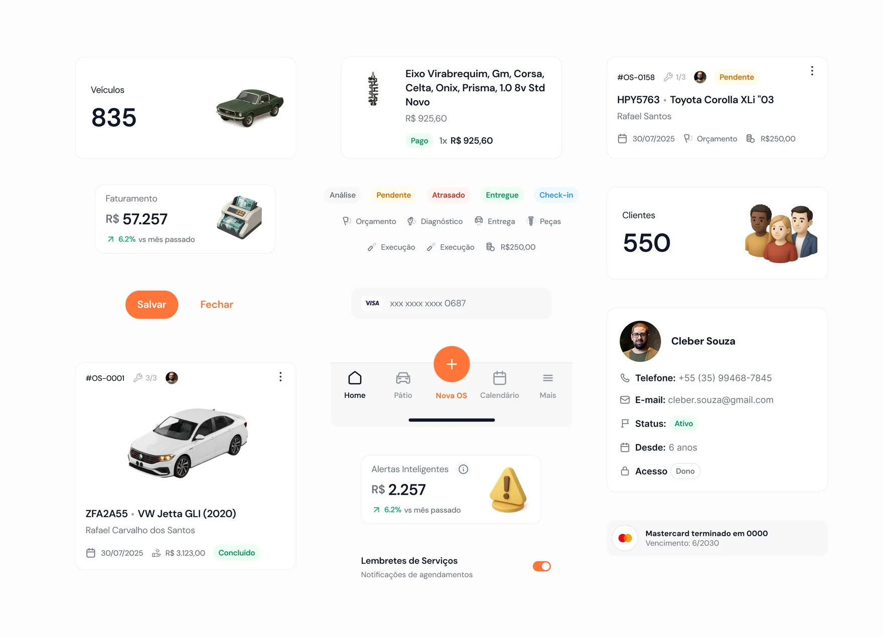
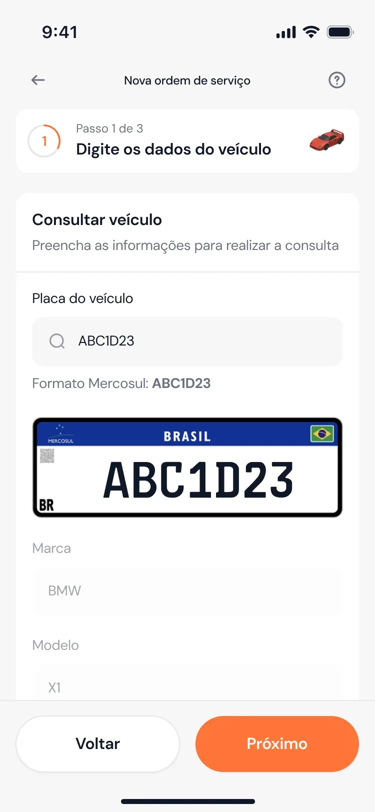
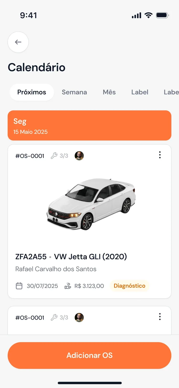
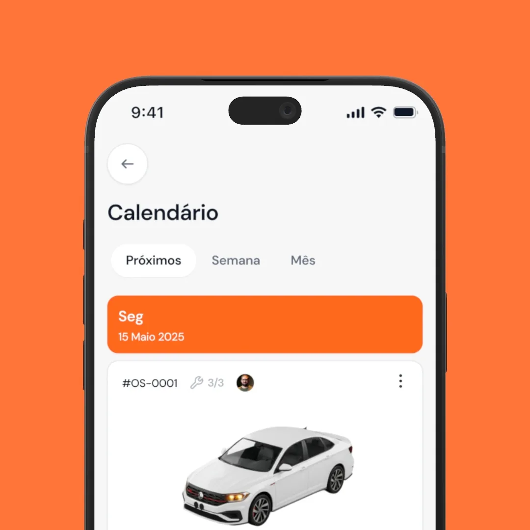
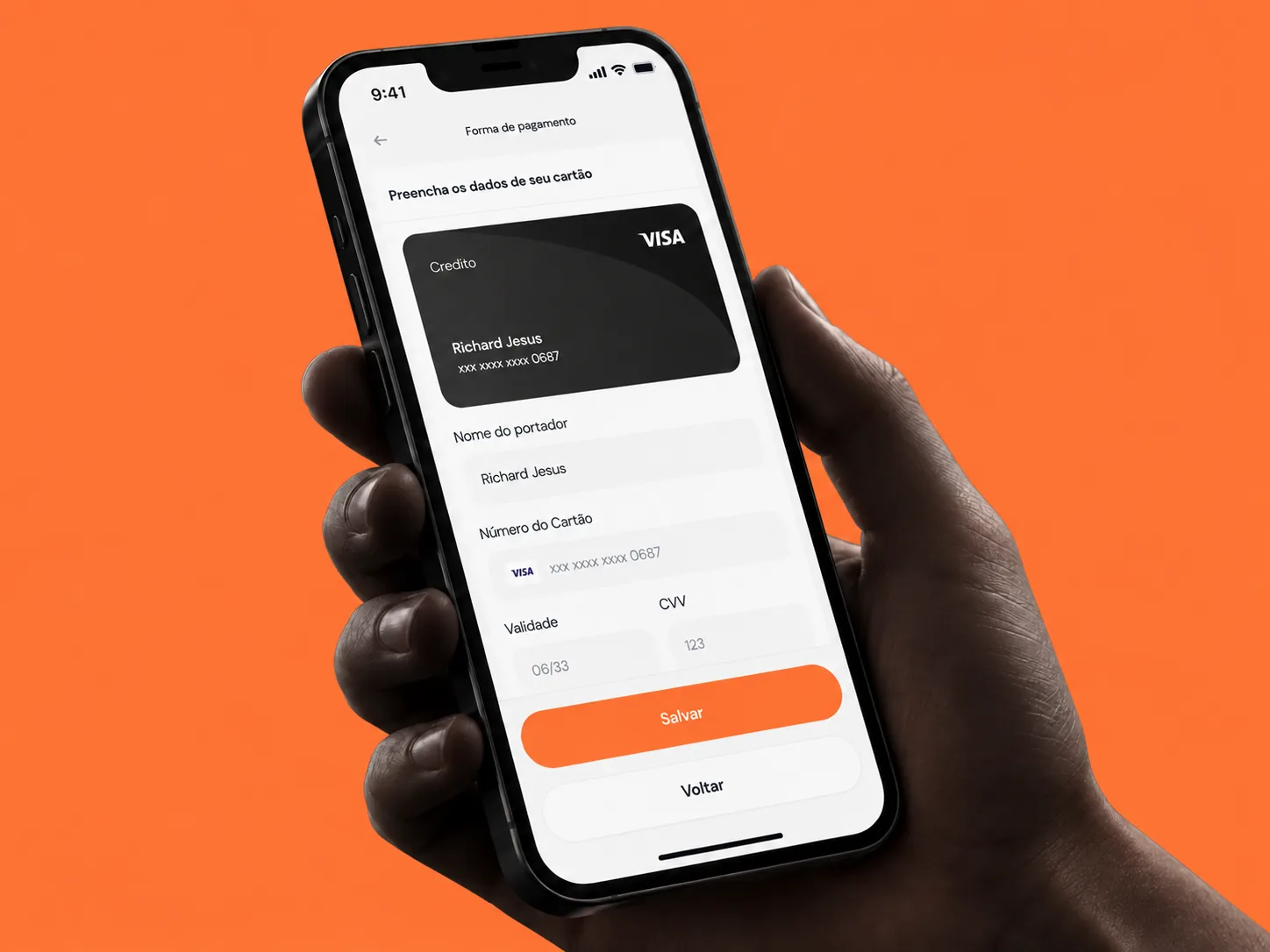
The challenge was to preserve on the phone the same consistency and quality as the desktop experience, without compromising the product’s scalability. To do this, I adapted the interface and its details to smaller screens.

Result
A more cohesive experience on smaller screens
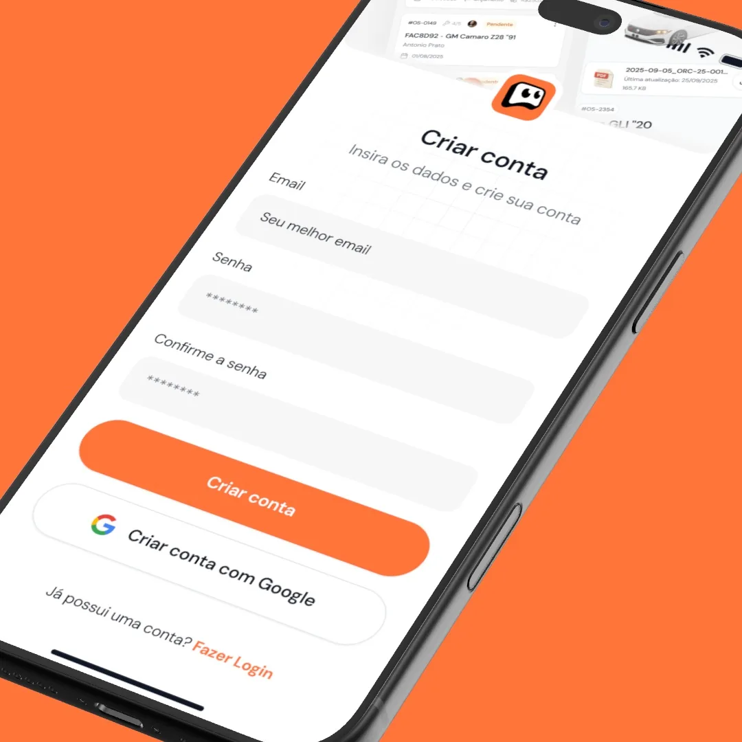
The set shows how navigation, indicators and forms fit on mobile with a consistent visual language. My work here was the responsive refinement of these screens.