
'%3e%3cpath%20fill='url(%23b)'%20d='M64.27%2072.566H28.303a7.376%207.376%200%200%201-7.374-7.375V27.506a1.1%201.1%200%200%201%201.085-1.086%201.1%201.1%200%200%201%201.086%201.086V65.19a5.204%205.204%200%200%200%205.203%205.203H64.27a1.1%201.1%200%200%201%201.086%201.086c-.046.588-.498%201.086-1.086%201.086Z'/%3e%3cpath%20fill='color(display-p3%20.0706%20.0706%20.0706)'%20fill-rule='evenodd'%20d='M28.213%2018a2.186%202.186%200%200%200-2.185%202.186v45.166a2.186%202.186%200%200%200%202.186%202.185H73.38a2.186%202.186%200%200%200%202.186-2.186v-9.07a6.6%206.6%200%200%201-.992%202.806c-.67%201.094-1.653%201.966-2.95%202.614-1.295.648-2.825.971-4.59.971-1.72%200-3.261-.278-4.624-.838-1.363-.558-2.457-1.385-3.284-2.479-.805-1.095-1.229-2.413-1.273-3.954h6.098c.09.871.391%201.541.905%202.01.514.447%201.184.67%202.011.67.849%200%201.519-.19%202.01-.57.492-.402.738-.949.738-1.64%200-.582-.202-1.062-.604-1.442-.38-.38-.86-.693-1.44-.938-.559-.246-1.363-.525-2.413-.838-1.52-.47-2.76-.939-3.72-1.407-.961-.47-1.787-1.162-2.48-2.079-.692-.916-1.039-2.11-1.039-3.586%200-2.188.793-3.897%202.38-5.126%201.585-1.251%203.652-1.876%206.2-1.876%202.59%200%204.68.625%206.265%201.876%201.587%201.229%202.436%202.949%202.547%205.16h-6.2c-.044-.76-.323-1.35-.837-1.776-.514-.446-1.173-.67-1.977-.67-.693%200-1.251.19-1.676.57-.424.357-.636.883-.636%201.575%200%20.76.357%201.352%201.072%201.776.715.424%201.832.882%203.351%201.374%201.519.514%202.748%201.005%203.686%201.475a7.016%207.016%200%200%201%202.48%202.043c.544.702.874%201.562.99%202.58V20.187A2.186%202.186%200%200%200%2073.38%2018H28.213Zm27.022%2036.931V38.915h-5.73V54.93c0%20.85-.19%201.498-.57%201.944-.38.447-.916.67-1.61.67-.759%200-1.34-.246-1.742-.737-.402-.514-.603-1.262-.603-2.245h-5.697c0%202.591.75%204.59%202.245%205.998%201.498%201.408%203.486%202.111%205.965%202.111%202.368%200%204.245-.67%205.63-2.01%201.408-1.34%202.112-3.25%202.112-5.73Z'%20clip-rule='evenodd'/%3e%3c/g%3e%3cdefs%3e%3clinearGradient%20id='b'%20x1='20.914'%20x2='65.322'%20y1='49.509'%20y2='49.509'%20gradientUnits='userSpaceOnUse'%3e%3cstop%20stop-color='color(display-p3%20.251%20.7961%20.9647)'/%3e%3cstop%20offset='1'%20stop-color='color(display-p3%20.5098%20.7529%20.2549)'/%3e%3c/linearGradient%3e%3cclipPath%20id='a'%3e%3cpath%20fill='%23fff'%20d='M20%2018h56v55H20z'/%3e%3c/clipPath%3e%3c/defs%3e%3c/svg%3e)
'%3e%3cpath%20fill='url(%23b)'%20d='M64.27%2072.566H28.303a7.376%207.376%200%200%201-7.374-7.375V27.506a1.1%201.1%200%200%201%201.085-1.086%201.1%201.1%200%200%201%201.086%201.086V65.19a5.204%205.204%200%200%200%205.203%205.203H64.27a1.1%201.1%200%200%201%201.086%201.086c-.046.588-.498%201.086-1.086%201.086Z'/%3e%3cpath%20fill='%23fff'%20fill-rule='evenodd'%20d='M28.213%2018a2.186%202.186%200%200%200-2.185%202.186v45.166a2.186%202.186%200%200%200%202.186%202.185H73.38a2.186%202.186%200%200%200%202.186-2.186v-9.07a6.6%206.6%200%200%201-.992%202.806c-.67%201.094-1.653%201.966-2.95%202.614-1.295.648-2.825.971-4.59.971-1.72%200-3.261-.278-4.624-.838-1.363-.558-2.457-1.385-3.284-2.479-.805-1.095-1.229-2.413-1.273-3.954h6.098c.09.871.391%201.541.905%202.01.514.447%201.184.67%202.011.67.849%200%201.519-.19%202.01-.57.492-.402.738-.949.738-1.64%200-.582-.202-1.062-.604-1.442-.38-.38-.86-.693-1.44-.938-.559-.246-1.363-.525-2.413-.838-1.52-.47-2.76-.939-3.72-1.407-.961-.47-1.787-1.162-2.48-2.079-.692-.916-1.039-2.11-1.039-3.586%200-2.188.793-3.897%202.38-5.126%201.585-1.251%203.652-1.876%206.2-1.876%202.59%200%204.68.625%206.265%201.876%201.587%201.229%202.436%202.949%202.547%205.16h-6.2c-.044-.76-.323-1.35-.837-1.776-.514-.446-1.173-.67-1.977-.67-.693%200-1.251.19-1.676.57-.424.357-.636.883-.636%201.575%200%20.76.357%201.352%201.072%201.776.715.424%201.832.882%203.351%201.374%201.519.514%202.748%201.005%203.686%201.475a7.016%207.016%200%200%201%202.48%202.043c.544.702.874%201.562.99%202.58V20.187A2.186%202.186%200%200%200%2073.38%2018H28.213Zm27.022%2036.931V38.915h-5.73V54.93c0%20.85-.19%201.498-.57%201.944-.38.447-.916.67-1.61.67-.759%200-1.34-.246-1.742-.737-.402-.514-.603-1.262-.603-2.245h-5.697c0%202.591.75%204.59%202.245%205.998%201.498%201.408%203.486%202.111%205.965%202.111%202.368%200%204.245-.67%205.63-2.01%201.408-1.34%202.112-3.25%202.112-5.73Z'%20clip-rule='evenodd'/%3e%3c/g%3e%3cdefs%3e%3clinearGradient%20id='b'%20x1='20.914'%20x2='65.322'%20y1='49.509'%20y2='49.509'%20gradientUnits='userSpaceOnUse'%3e%3cstop%20stop-color='color(display-p3%20.251%20.7961%20.9647)'/%3e%3cstop%20offset='1'%20stop-color='color(display-p3%20.5098%20.7529%20.2549)'/%3e%3c/linearGradient%3e%3cclipPath%20id='a'%3e%3cpath%20fill='%23fff'%20d='M20%2018h56v55H20z'/%3e%3c/clipPath%3e%3c/defs%3e%3c/svg%3e)
Turning a landing page into an institutional website for a growing learning platform.
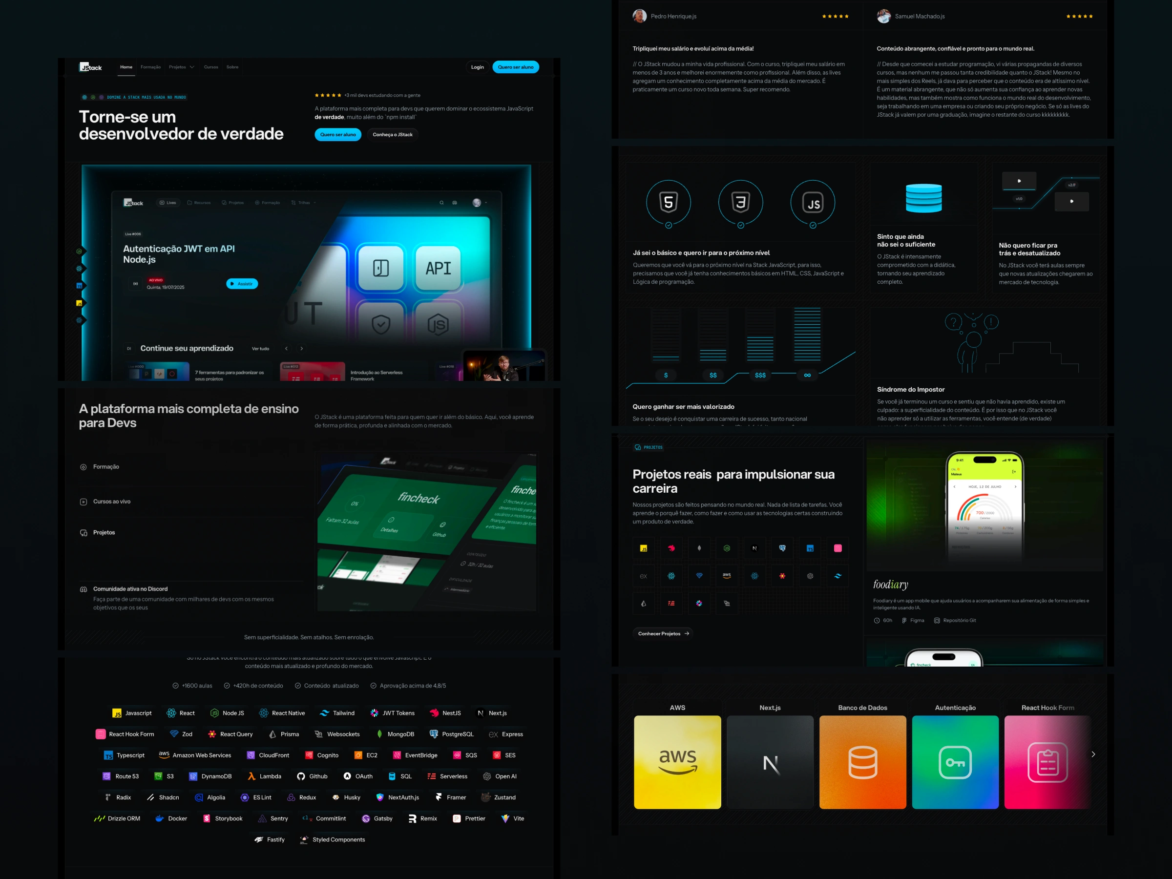
I restructured JStack's institutional presence to explain its evolution from course to platform more clearly, connecting content, product, projects and subscription in a more complete experience.
- Product Design
- Web Design
- No-code
%20scale(3)'%3e%3c/rect%3e%3cpath%20d='M144%20216C144%20176.641%20175.907%20144.733%20215.267%20144.733V144.733C254.626%20144.733%20286.534%20176.641%20286.534%20216V216C286.534%20255.36%20254.626%20287.267%20215.267%20287.267V287.267C175.907%20287.267%20144%20255.36%20144%20216V216Z'%20fill='%231ABCFE'%3e%3c/path%3e%3cpath%20d='M1.46603%20358.534C1.46603%20319.175%2033.3733%20287.267%2072.733%20287.267H144V358.534C144%20397.894%20112.093%20429.801%2072.733%20429.801V429.801C33.3733%20429.801%201.46603%20397.894%201.46603%20358.534V358.534Z'%20fill='%230ACF83'%3e%3c/path%3e%3cpath%20d='M144%202.19946V144.733H215.267C254.627%20144.733%20286.534%20112.826%20286.534%2073.4664V73.4664C286.534%2034.1068%20254.627%202.19946%20215.267%202.19946L144%202.19946Z'%20fill='%23FF7262'%3e%3c/path%3e%3cpath%20d='M1.46603%2073.4664C1.46603%20112.826%2033.3733%20144.733%2072.733%20144.733L144%20144.733L144%202.19941L72.733%202.19941C33.3733%202.19941%201.46603%2034.1067%201.46603%2073.4664V73.4664Z'%20fill='%23F24E1E'%3e%3c/path%3e%3cpath%20d='M1.46603%20216C1.46603%20255.36%2033.3733%20287.267%2072.733%20287.267H144L144%20144.733L72.733%20144.733C33.3733%20144.733%201.46603%20176.641%201.46603%20216V216Z'%20fill='%23A259FF'%3e%3c/path%3e%3c/svg%3e)
Overview
A site that had to catch up with the platform.
JStack started with a landing page for a course. As the business evolved into a subscription platform with live classes, a Formation, projects and resources, the site had to explain a much larger ecosystem.
This case follows the evolution across several versions and the redesign of the institutional website that brought the offer together in one clearer structure.
Challenge
The offer had grown faster than the explanation.
The 2024 institutional version still generated questions about what the training was, what students received, how the courses worked and how each part of the platform connected.
The challenge was not only to polish the interface. It was to rethink the copy, sitemap and page structure so a visitor could understand the current business model without needing a conversation first.
Evolution
From course landing page to platform narrative.
Structure
The redesign started with content, not components.
We stepped back from the previous UI and rebuilt the foundation: a new copy direction, a clearer sitemap, wireframes and visual references.
The first explorations were intentionally rough. Their job was to make the hierarchy visible before the final UI was assembled in Framer.
Interaction
Motion made the platform feel alive without hiding the message.
The hero used Unicorn Studio to introduce a WebGL layer, while LottieLab added motion to selected areas where animation helped explain the product or create rhythm.
The tools were chosen as part of the communication system, not as decoration. The goal was to give a complex institutional site a more expressive entry point while keeping the information legible.
Production
A flexible production model for a multi-page site.
The CMS was reserved for course lessons and synchronized with Excel to keep class management practical. The other pages used Framer Templates, allowing the team to replicate a structure while changing the content.
This balance kept the system simple for the actual workflow: structured where recurring content needed management, and reusable where pages shared a common pattern.
Visit jstack.com.brFinal result
One institutional home for the whole ecosystem.
Impact
Better structure made the business easier to explain and scale.
- The project report attributes a growth of more than 30% in the number of students to the evolution of the site and offer.
- The site supported the migration from the course model to the subscription model with clearer communication.
- Framer reduced website delivery time by two months and made new launches easier to replicate.
- A focused CMS setup and reusable templates made a multi-page site easier to maintain.
Testimonial
A clearer expression of what JStack had become.
The new design of our landing page perfectly captured the essence of JStack and helped us communicate our evolution as a company. The feedback from our students has been incredible!
Learnings
The strongest result started before the final interface.
- Clear communication is part of the product: explaining what each offer includes reduces uncertainty and builds trust.
- A stronger sitemap and copy foundation can unlock a better visual result than incremental UI changes alone.
- Iterating backwards is sometimes progress: revisiting the structure made the final experience more coherent.
- Tools such as Framer, LottieLab and Unicorn Studio were useful when they served a clear communication goal.
Next Case Study
Talqui
AI-powered support platform, redesign, and design system