Platform identity
The interface stopped feeling like a technical adaptation. It now has its own product language for Talqui.
Talqui
%20scale(3)'%3e%3c/rect%3e%3cpath%20d='M144%20216C144%20176.641%20175.907%20144.733%20215.267%20144.733V144.733C254.626%20144.733%20286.534%20176.641%20286.534%20216V216C286.534%20255.36%20254.626%20287.267%20215.267%20287.267V287.267C175.907%20287.267%20144%20255.36%20144%20216V216Z'%20fill='%231ABCFE'%3e%3c/path%3e%3cpath%20d='M1.46603%20358.534C1.46603%20319.175%2033.3733%20287.267%2072.733%20287.267H144V358.534C144%20397.894%20112.093%20429.801%2072.733%20429.801V429.801C33.3733%20429.801%201.46603%20397.894%201.46603%20358.534V358.534Z'%20fill='%230ACF83'%3e%3c/path%3e%3cpath%20d='M144%202.19946V144.733H215.267C254.627%20144.733%20286.534%20112.826%20286.534%2073.4664V73.4664C286.534%2034.1068%20254.627%202.19946%20215.267%202.19946L144%202.19946Z'%20fill='%23FF7262'%3e%3c/path%3e%3cpath%20d='M1.46603%2073.4664C1.46603%20112.826%2033.3733%20144.733%2072.733%20144.733L144%20144.733L144%202.19941L72.733%202.19941C33.3733%202.19941%201.46603%2034.1067%201.46603%2073.4664V73.4664Z'%20fill='%23F24E1E'%3e%3c/path%3e%3cpath%20d='M1.46603%20216C1.46603%20255.36%2033.3733%20287.267%2072.733%20287.267H144L144%20144.733L72.733%20144.733C33.3733%20144.733%201.46603%20176.641%201.46603%20216V216Z'%20fill='%23A259FF'%3e%3c/path%3e%3c/svg%3e)
Challenge
The previous Talqui platform lacked shared design standards or documentation. This made it harder to maintain consistency, improve the interface and grow the product. My role was to create this shared foundation, from the design system to the platform screens.
Before
The old support and settings screens show the starting point. They include navigation, conversation lists, forms and customer panels that needed shared standards. Usage guidelines were missing too.
How we solved it
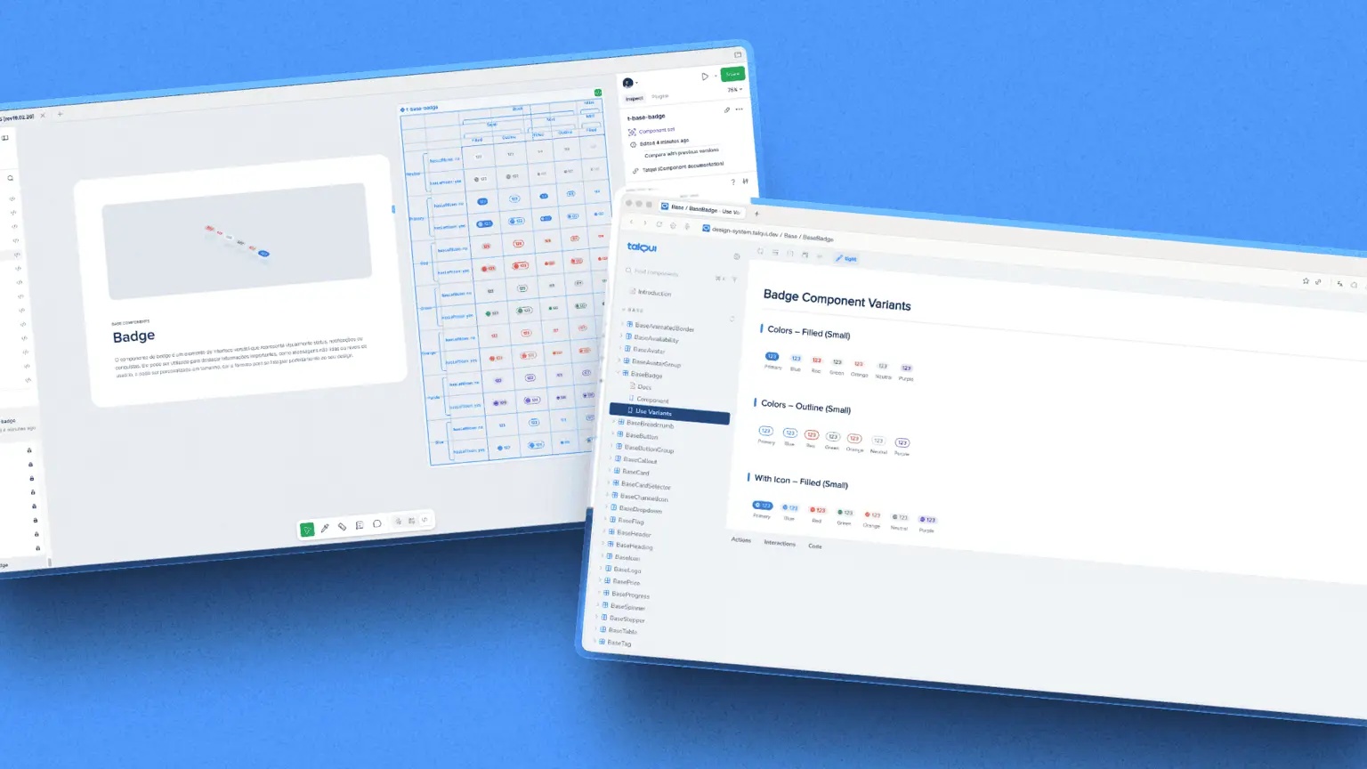
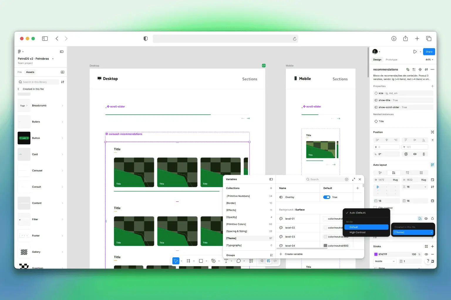
The design system was built from the ground up to grow. Variables, design tokens, components, and patterns were organized as a product foundation.
I created the design tokens with custom naming. This brings brand semantics, interface logic, and implementation closer together and reduces ambiguity for the team.
Developers created a dedicated repository for the design system. They keep it updated and sync the documentation with Storybook, making the project easier to expand and update.
Design System
Foundations
The interface stopped feeling like a technical adaptation. It now has its own product language for Talqui.
Variables have names that follow their own logic to make use, maintenance, and connection to code easier.
Components made for different contexts, states, and updates without creating new patterns for every screen.
The developers created their own base for the design system and keep it updated with the platform.
Technical documentation is in sync with Storybook. This creates an updated reference for the team.
The team rebuilt the platform with new screens and flows using this visual and technical foundation.
Process
I rebuilt the platform using an older version that was a fork of an interface created by the development team.
Creation of a platform identity that follows the Talqui brand. This connects the product, experience, and visual language.
Creation of the design system with variables, design tokens, and components made to grow and stay maintained.
Defining a custom name for the tokens, bringing the meaning of design and implementation closer together.
Solution
New platform with its own language. It fits the brand better and is ready for future changes.
Versioned design system with its own repository, maintenance by the development team, and documentation kept up to date.
Tokens and components organized to avoid random decisions. This helps create new screens faster without losing consistency.
A foundation that is easier to expand with updates, new flows, new functions, and the evolution of the AI support product.
Next Case Study
Component library, design tokens and documentation