Design Tokens
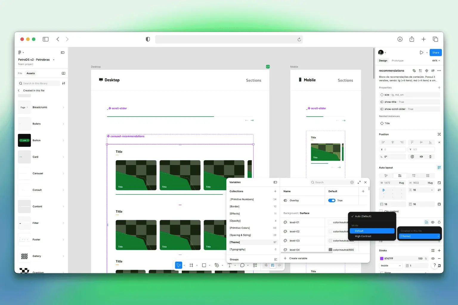
Colors, typography, spacing, and sizes organized as style variables to reduce ad-hoc decisions.

Petrobras
%20scale(3)'%3e%3c/rect%3e%3cpath%20d='M144%20216C144%20176.641%20175.907%20144.733%20215.267%20144.733V144.733C254.626%20144.733%20286.534%20176.641%20286.534%20216V216C286.534%20255.36%20254.626%20287.267%20215.267%20287.267V287.267C175.907%20287.267%20144%20255.36%20144%20216V216Z'%20fill='%231ABCFE'%3e%3c/path%3e%3cpath%20d='M1.46603%20358.534C1.46603%20319.175%2033.3733%20287.267%2072.733%20287.267H144V358.534C144%20397.894%20112.093%20429.801%2072.733%20429.801V429.801C33.3733%20429.801%201.46603%20397.894%201.46603%20358.534V358.534Z'%20fill='%230ACF83'%3e%3c/path%3e%3cpath%20d='M144%202.19946V144.733H215.267C254.627%20144.733%20286.534%20112.826%20286.534%2073.4664V73.4664C286.534%2034.1068%20254.627%202.19946%20215.267%202.19946L144%202.19946Z'%20fill='%23FF7262'%3e%3c/path%3e%3cpath%20d='M1.46603%2073.4664C1.46603%20112.826%2033.3733%20144.733%2072.733%20144.733L144%20144.733L144%202.19941L72.733%202.19941C33.3733%202.19941%201.46603%2034.1067%201.46603%2073.4664V73.4664Z'%20fill='%23F24E1E'%3e%3c/path%3e%3cpath%20d='M1.46603%20216C1.46603%20255.36%2033.3733%20287.267%2072.733%20287.267H144L144%20144.733L72.733%20144.733C33.3733%20144.733%201.46603%20176.641%201.46603%20216V216Z'%20fill='%23A259FF'%3e%3c/path%3e%3c/svg%3e)

Context
Petrobras needed a common visual and technical foundation for more than 100 pages across its digital ecosystem. I led the Design System architecture, component standardization, documentation and adoption with Design and Development.
The delivery-time figures shown in this case are project-reported references; they describe the intended improvement from the new system and should be read alongside the evidence and limits of the project.
Challenge
Petrobras had more than 100 pages built without a shared visual language. The result was inconsistency, slower delivery, and recurring rework between design and development.
The challenge was to create a shared foundation that could serve different products and teams while remaining viable within the Liferay platform.
Before
Each product area evolved with isolated interface decisions, which increased visual inconsistency and made common page patterns expensive to reproduce.
Design and Development lacked a common source for tokens, components, responsive behavior, and implementation guidance.
How we solved it
Foundations
Colors, typography, spacing, and sizes organized as style variables to reduce ad-hoc decisions.
Buttons, cards, tabs, accordions, and interface patterns documented with states, anatomy, and usage rules.
Reusable blocks like hero banners, menus, footers, and content areas to speed up editorial pages.
Page models by level, error state, and institutional structure to maintain consistency across flows and teams.
Motion guidelines to direct transitions, feedback, and behaviors without breaking performance.
Contrast, readability, focus, structure, and inclusion rules to support a more robust public experience.
Implementation
One of the project's main challenges was balancing Design needs with the technical constraints imposed by the Liferay platform.
Because development was handled by a third-party company, several decisions required negotiation to preserve the user experience without compromising technical feasibility. This process directly influenced the component architecture and the system's evolution.
Process
Inventory of existing patterns across the Petrobras ecosystem to understand redundancies, inconsistencies, and gaps.
Definition of visual and structural foundations to create a common language across the portal, main site, and new pages.
Manual Notion documentation with examples, anatomy, specs, variants, states, and implementation guidelines.
Organization of components, sections, and templates to bring design, content, Liferay, and development closer together.
Manual documentation
Documentation was a central part of the case. Every decision needed to be understandable outside Figma: variations, states, composition rules, responsive behavior, and usage limits were described to guide implementation across the Petrobras ecosystem.
Governance
Any designer on the team could propose improvements or new components. Changes were evaluated jointly by Design and Development.
Incremental changes were released as patches, while structural changes created new component versions to avoid large-scale impact.
Adoption
Documentation was the main alignment tool between teams. Weekly presentations with designers, developers, and stakeholders shared updates, validated decisions, and reinforced the correct use of components.
Accessible documentation, continuous training, and close support contributed to consistent adoption of the system across all new projects.
Impact
Evidence
Foundation gallery with colors, typography, breakpoints, effects, borders, icons, spacing, illustrations, sizing, and images.
Notion catalog organized by groups like Actions and Content, with buttons, accordion, avatar, bullet, and cards.
Example of manual documentation for the Bullet component, detailing elements, function, colors, and composition rules.
Example of horizontal variant with measurements, properties, and tokens like padding, radius, gaps, width, and height.
Results
Connection
Nossa Energia can be understood as a direct application of this foundation: an editorial portal built on previously defined components, sections, and templates.
This relationship is the most important point of the case: the design system created a foundation for multiple digital experiences with more consistency and speed.
Next Case Study
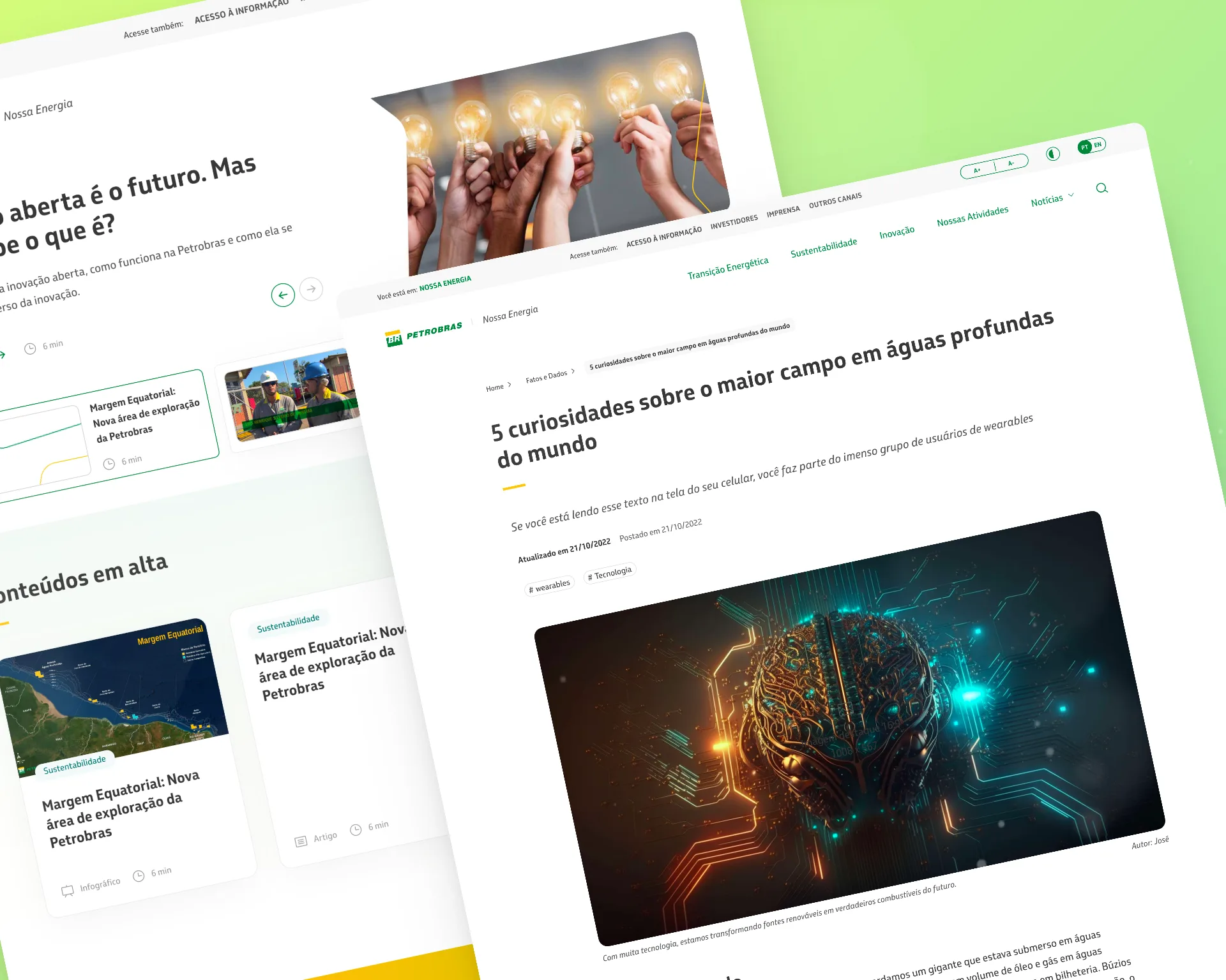
Editorial content hub connected to the design system